Why Your Ceiling Is the Most Overlooked Design Element
Colorful Ceilings Are Becoming a Major Design Trend
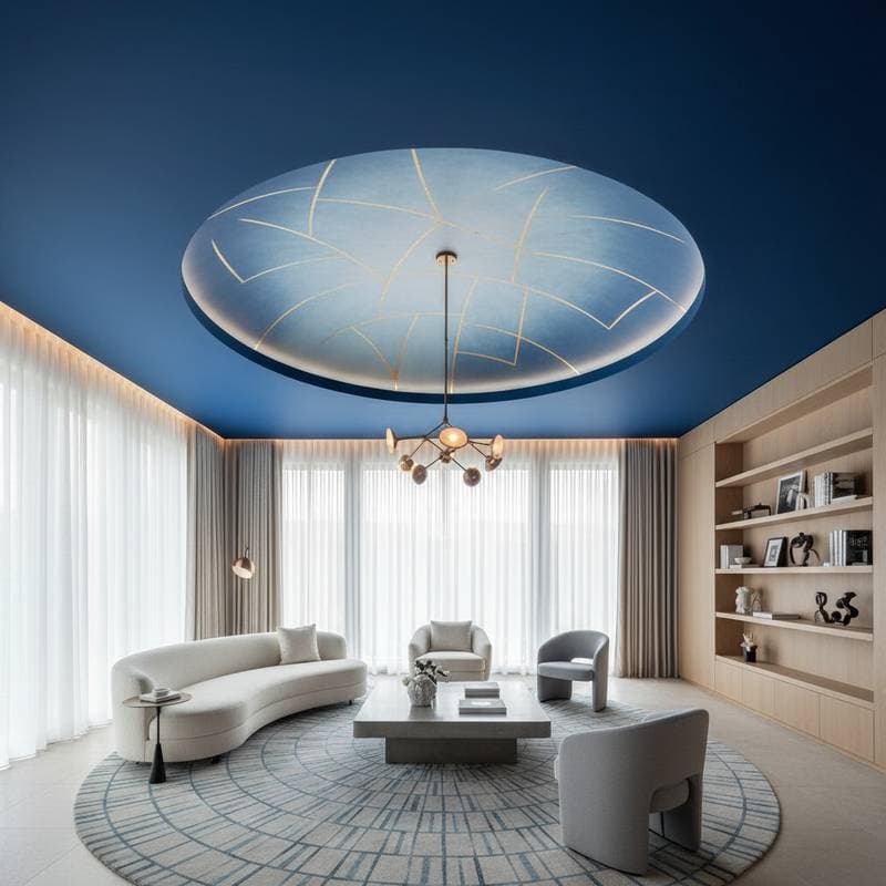
Painting the living room walls and updating the flooring often leaves a space feeling incomplete. The ceiling remains plain white in most homes. Designers now treat this surface as a key element that shapes mood and proportions.
A soft blush tone warms incoming light. A deep navy creates intimacy in dining areas. Color on the ceiling changes how a room feels without requiring new furniture.
The Opportunity Above
Homeowners select wall colors and lighting yet overlook the ceiling. This surface sets the atmosphere for the entire room. Light hues expand the sense of space. Bold tones add coziness and anchor the design.
The trend reflects a desire for complete, immersive rooms. The ceiling provides creative options that do not overwhelm other surfaces.
Why Colorful Ceilings Are Capturing Attention
Designers now recommend ceiling color because it adds depth quickly. Several benefits explain the growing interest.
- Mood Enhancement: Pale aqua creates a calm bathroom atmosphere. Soft terracotta brings warmth to kitchens.
- Architectural Balance: Matching ceiling and wall tones prevents a top-heavy appearance.
- Visual Interest: Color draws attention upward and highlights moldings or fixtures.
- Creative Freedom: The surface stays out of direct view, reducing the chance of tiring of the choice.
How to Choose the Right Ceiling Color
Room size, light levels, and function guide the selection. Small rooms benefit from sky blue or pale lavender. Large rooms gain intimacy from charcoal or forest green.
Low ceilings appear taller with colors slightly lighter than the walls. High ceilings feel balanced with deeper shades. Strong natural light supports richer hues. Limited light calls for reflective tones such as pearl gray.
Pairing Colors Seamlessly
Treat the ceiling as part of the overall palette. Tone-on-tone uses a lighter or darker version of the wall color. High contrast pairs crisp white ceilings with deep navy walls.
Warm ceiling colors balance cool wall tones. Metallic accents add subtle glamour in dining areas.
Going Beyond Paint
Wallpaper with subtle patterns introduces texture. Wood planks suit coastal or farmhouse styles. Venetian plaster creates depth that interacts with light. Stencils turn the surface into a focal point for those ready for bolder statements.
The Role of Lighting
Warm bulbs soften colors. Cool LEDs sharpen them. Test samples at different times of day. Matte finishes absorb light for calm effects. Satin finishes add gentle reflection.
Practical Considerations
Preparation includes covering furniture and cleaning the surface. Use ceiling-specific primer for even coverage. An extension pole reduces strain during application. Allow full drying time between coats, especially with saturated colors.
Professionals handle overhead work safely and advise on finishes suited to the room.
Cost and Value
Ceiling painting typically ranges from several hundred to a few thousand dollars. The investment improves perceived quality without replacing other elements.
Making It Fit Your Local Climate
Humid regions favor lighter, reflective colors. Cooler areas benefit from warm tones. UV-resistant formulas prevent fading in sunny locations. Mildew-resistant finishes perform better where moisture is common.
Bringing the Trend Home
Start with a powder room or bedroom. Pale mint ceilings over cream walls create a breezy sunroom. Midnight blue ceilings above velvet seating produce a cocoon effect in living rooms.
Applying These Ideas
Color on the ceiling completes the room. The result is a space with greater depth and personal character.