
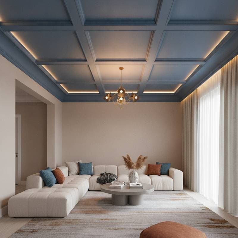
Colorful Ceilings Turn the Fifth Wall into a Focal Point
After painting walls, selecting flooring, and arranging furniture, a room can still lack completion. The ceiling, known as the fifth wall, offers an opportunity to add depth and character. Applying color to this surface shifts a space from ordinary to distinctive.
Overlooked Ceilings Limit Design Impact
Many ceilings receive only white paint as a default choice. This approach creates a flat appearance because light reflects uniformly without contrast. Introducing color changes how light moves through the room and connects the overall palette.
A navy ceiling above cream walls, for example, draws attention upward. A soft blush tone in a bedroom adds warmth. These choices make the room feel intentional and cohesive.
Benefits of Coloring the Fifth Wall
Color on the ceiling balances presence with restraint. It can make compact rooms feel enclosed and comfortable. In taller spaces, it reduces the sense of emptiness. Open areas gain unity when the ceiling shares tones with other surfaces.
Architectural details such as crown molding or coffered panels gain definition with color. A teal ceiling against white trim highlights the structure. Charcoal within paneled sections creates a layered effect.
Selecting Colors That Match Room Goals
Color choice depends on the desired atmosphere. Consider these options:
- Soft neutrals such as pale gray or greige provide subtle contrast in well-lit rooms.
- Deep shades including charcoal or forest green create intimacy in dining areas or dens.
- Pastels like powder blue or mint promote calm in bedrooms.
- Bold tones such as terracotta suit spaces with neutral furnishings.
- Metallic or gloss finishes reflect light and enhance fixtures.
How Color Changes Room Perception
Lighter ceiling colors increase the sense of height. Darker tones lower the perceived ceiling and add enclosure. Cool hues promote calm while warmer shades energize. Test samples on the ceiling surface because light behaves differently on vertical and horizontal planes.
Natural light softens intense colors during daylight hours. Artificial lighting at night deepens the richness. Adjust fixture placement to complement the chosen finish.
Steps to Achieve Visual Harmony
Integrate the ceiling color through repeated accents in pillows or artwork. White trim frames the color while matching trim creates an enveloping effect. Dark floors pair well with slightly lighter ceiling tones. Matte finishes absorb light for a restful mood. Satin finishes reflect light for added energy.
Preparation and Execution Details
Protect surfaces with drop cloths before starting. Apply primer under bold colors for even results. High ceilings require proper equipment and safety measures. Professional assistance ensures clean lines and regulatory compliance.
Average costs depend on room size and paint type. A standard room requires one or two days. Complex patterns extend the schedule.
Alternative Ceiling Treatments
Wallpaper introduces patterns or textures. Wood beams add natural warmth. Murals provide custom designs. Two-tone combinations emphasize architectural lines.
Maintaining the Finished Result
Use directional lighting to accent texture. Recessed fixtures create soft illumination. Dust regularly and repaint every few years to preserve appearance. Washable finishes allow gentle cleaning.
Applying the Approach
A colored ceiling reframes the entire room. Deep green suits a cozy den. Pale yellow brightens a kitchen. These surfaces reward careful planning with a personal and expressive interior.