2025 Dopamine Colors: Elevate Your Home's Mood
You enter your living room and sense something lacks vitality. The furniture suits the space, yet the overall energy remains subdued. Homeowners increasingly recognize that color choices extend beyond aesthetics to influence emotional well-being. The emerging dopamine décor trend addresses this by infusing spaces with hues that promote pleasure and motivation.
Why Homeowners Embrace Dopamine Décor
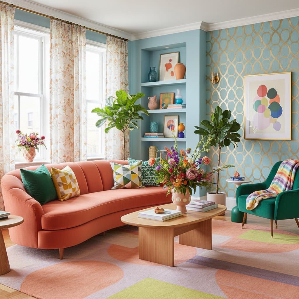
Dopamine décor employs color and pattern to generate happiness and vitality. The concept draws from dopamine, the neurotransmitter linked to pleasure and drive. Surrounding yourself with joyful colors triggers positive brain responses. This method prioritizes personal feel over rigid guidelines, resulting in spaces that uplift upon entry.
Neutral gray schemes and minimalist designs have lost appeal for many. Individuals seek warmth, vibrancy, and personal expression. Dopamine colors achieve this through bold shades, playful contrasts, and nostalgic elements that revitalize home design.
The Principles of Dopamine Colors
This trend emphasizes emotion-guided selections. Rather than matching items solely for visual harmony, choose elements that evoke energy, serenity, or inspiration. Personal resonance guides decisions; a coral sofa may delight one resident, while another favors teal walls accented with mustard.
Balance remains essential to avoid overload. A thoughtful blend of colors can instantly shift ambiance. Design with intended emotions in mind, ensuring the space supports desired feelings.
Key Dopamine Colors for Interiors
While preferences vary, specific shades consistently evoke positive responses in dopamine-inspired designs. These colors enhance energy and warmth effectively.
- Sunny Yellow: This bright tone fosters creativity and optimism. Apply it in kitchens for meal preparation energy, home offices for productive focus, or entryways to welcome positivity.
- Coral Pink: Blending orange and pink, coral offers modern comfort. Pair it with crisp white walls or soft beige textiles for harmonious contrast.
- Sky Blue: Gentle blue shades encourage calm and concentration. Use them in bedrooms to promote restful sleep or reading nooks for relaxed immersion.
- Terracotta: Warm orange-red earth tones provide grounded stability. Integrate with natural wood furniture and woven fabrics for organic depth.
- Emerald Green: Rich green symbolizes growth and refreshment. Incorporate in living rooms for lively gatherings or bathrooms for spa-like tranquility.
- Vibrant Lavender: Subtle purple adds creative flair without intensity. Combine with gold hardware or cream upholstery for elegant sophistication.
Incorporate these hues boldly on walls or subtly via accessories like pillows and artwork. Select intensity levels that align with your space's scale and your comfort.
Applying Dopamine Colors by Room
Living Room: Select one accent wall in a warm shade like coral or mustard yellow. Layer with patterned cushions, a vibrant area rug, or colorful framed prints. Anchor with neutral upholstery to maintain equilibrium.
Kitchen: Revive cabinetry with cheerful paints on lower units in green or yellow. For understated changes, introduce vibrant bar stools or patterned ceramic tiles on the backsplash.
Bedroom: Opt for calming yet uplifting tones such as soft blue, blush pink, or lilac. Apply to bedding sets, window treatments, or upholstered headboards to enhance serenity.
Bathroom: Bold colors suit compact areas; consider teal or emerald tiles alongside sunny yellow accents. Balance with white fixtures or light gray surfaces for crisp definition.
Home Office: Energize with motivational shades like sky blue, mint green, or coral. Infuse color through motivational wall art or organized storage bins, even against neutral walls.
Steps to Introduce Dopamine Colors Practically
-
Begin Modestly: Update accessories such as throw pillows, table lamps, or window panels before tackling larger commitments like wall painting.
-
Sample Paints Thoroughly: Apply several swatches to walls and evaluate their appearance under morning light, afternoon sun, and evening lamps. Natural and artificial illumination alters perceptions significantly.
-
Blend Tones Strategically: Merge vivid colors with subdued neutrals. For instance, a bold yellow wall complements raw wood tables and chairs seamlessly.
-
Incorporate Diverse Textures: Enhance color vibrancy by mixing materials; velvet cushions against linen drapes or rattan baskets create visual interest.
-
Define Zones with Color: In open layouts, delineate areas using distinct hues, such as coral for a dining zone adjacent to a green kitchen section.
Budgeting for Color Transformations
Incorporating dopamine colors need not strain finances. Expenses vary based on project scope.
-
Paint Supplies: High-quality interior paint costs 40 to 80 dollars per gallon. Hiring professionals adds 2 to 5 dollars per square foot for application.
-
Accessories: Items like pillows, rugs, and artwork range from 20 to 200 dollars apiece, influenced by dimensions and fabrics.
-
Furniture Updates: Vibrant sofas or chairs start at 600 dollars and escalate to thousands for custom pieces.
-
Approach Choices: Tackle painting as a weekend project with basic tools if skilled. Engage experts for intricate details like cabinet refinishing to achieve flawless results.
For multi-room updates, allocate 1,000 to 3,500 dollars covering supplies and labor. Include time for surface preparation, including repairs, smoothing, and priming.
Preparation and Safety Measures
Ensure ample ventilation during indoor painting by opening windows and operating fans. Don a respirator for oil-based formulas, and restrict access to painted zones until fully dry for pets and children.
In pre-1978 homes, screen for lead paint prior to any scraping or sanding. Testing services charge 100 to 300 dollars, providing essential safety assurance.
Color Psychology's Impact on Well-Being
Studies in color psychology demonstrate that specific hues shape emotions and actions. Warm tones like orange energize, whereas cool blues soothe. Intentional application turns homes into nurturing settings.
A sunny yellow corridor invigorates daily routines. Gentle green in sleeping areas aids evening wind-down. Even minor elements, such as colorful kitchenware or bath linens, subtly elevate mood throughout the day.
Sustaining a Vibrant Home Over Time
Personality-infused colorful spaces endure longer than trend-driven neutrals. They adapt as life evolves; swap accents or refresh a single wall to maintain freshness without extensive overhauls.
For resale, vibrant designs carry risks and benefits. Neutral preferences exist, yet distinctive, executed palettes can differentiate properties in competitive markets.
Implement Your Dopamine Design
Tailor dopamine elements to your unique preferences rather than imitating online examples. Experiment in one room with sample colors and observe emotional shifts.
Color wields influence over vitality, ease, and home attachment. Viewing surroundings through an emotional lens transforms decoration into a rewarding pursuit.