
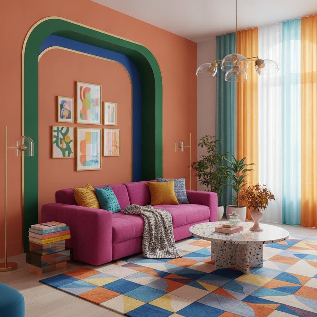
Dopamine Design: Chromatic Maximalism for Joyful Homes
A room that feels instantly uplifting often features colors that hum with energy. Dopamine design blends color psychology, texture, and playful maximalism to create spaces that improve daily mood. The approach rejects rigid rules in favor of choices that promote genuine joy.
Reasons Homeowners Choose This Approach
Homeowners increasingly replace muted palettes with richer, more personal options. Neutral interiors can feel sterile after extended time spent indoors. Dopamine design counters this effect by adding warmth, individuality, and optimism through deliberate color and texture selections.
Intentional color use influences mood, energy, and productivity. A kitchen in sunny yellow tones can energize morning routines. A bathroom in turquoise tile can promote calm at the end of the day. Each hue contributes to a lived narrative that the design invites residents to inhabit.
Core Principles of Chromatic Maximalism
Chromatic maximalism serves as the visual language of dopamine interiors. It remains indulgent yet thoughtful, bold yet balanced. A living room might combine coral velvet seating, cobalt rugs, and brass accents while natural wood and linen elements maintain overall harmony.
The style emphasizes layered color, pattern, and form rather than clutter. A successful maximalist space appears curated. Intention guides every decision from paint to lighting so that each element evokes feeling instead of mere visual impact.
Practical Steps to Introduce Dopamine Design
Small experiments often produce the best results. Begin with one room and observe how new hues affect daily experience. The following methods provide clear starting points.
- Select one statement space such as a kitchen or home office. Apply a saturated wall color like coral or emerald, then add contrasting curtains or stools.
- Adapt the 60-30-10 ratio so that saturated color covers 60 percent of surfaces, textured or patterned elements occupy 30 percent, and neutral accents provide 10 percent of visual rest.
- Layer contrasting materials such as velvet against rattan or marble against wool. Pair large-scale patterns with smaller ones to sustain visual movement.
- Display artwork, vintage objects, and personal items that genuinely please the eye. These pieces turn the room into a reflection of individual experience.
- Adjust lighting to support chosen tones. Warm bulbs enhance reds and oranges while cooler light freshens blues and greens.
Color Psychology and Its Effects
Color combinations that feel exciting or comforting can prompt the brain to release dopamine. Research in color psychology now informs design decisions aimed at well-being.
- Red increases energy and suits social areas.
- Yellow encourages creativity and works well in kitchens or studios.
- Green promotes calm and fits bedrooms or living rooms.
- Blue reduces mental strain and suits bathrooms or workspaces.
- Pink adds warmth and suits smaller rooms.
Personal preference determines the final palette. The most effective schemes reflect individual responses rather than external trends.
Maintaining Balance and Managing Cost
Strong color requires grounding elements to avoid visual overload. Natural materials such as wood or stone stabilize energy. White trim and simple flooring supply moments of visual rest.
Budget-friendly tactics include painting single accent walls, reupholstering one chair, or adding colorful pillows and rugs. Removable wallpaper allows pattern testing before permanent commitment.
Safety Considerations During Implementation
Structural changes, electrical work, or plumbing updates require permits and code compliance. Safety measures keep the finished space functional over time. Clear communication of both aesthetic and emotional goals helps professionals translate vision into durable results.
Personalization and Seasonal Adaptation
Successful dopamine interiors feel deeply personal. A hallway in sunset orange can reference a favorite trip. Seasonal swaps, such as citrus linens in summer or deeper burgundy textiles in winter, keep the environment responsive to changing needs.
Current Interpretations by Design Professionals
Professionals now integrate bold tones into structural features like staircases. Modular systems allow color panels to change as preferences evolve. Light-responsive materials that shift tone with daylight extend the sensory dimension of the approach.
Bringing the Vision to Life
Identify colors that produce the strongest positive response through nature, art, or travel references. Decide the desired level of boldness before proceeding. Experienced guidance helps maintain cohesion while preserving personality and emotional impact.